Visualizing Data
Charts in EzuneDB are one question away — ask for a trend, a comparison, or a breakdown and get an interactive visualization built from your real rows.
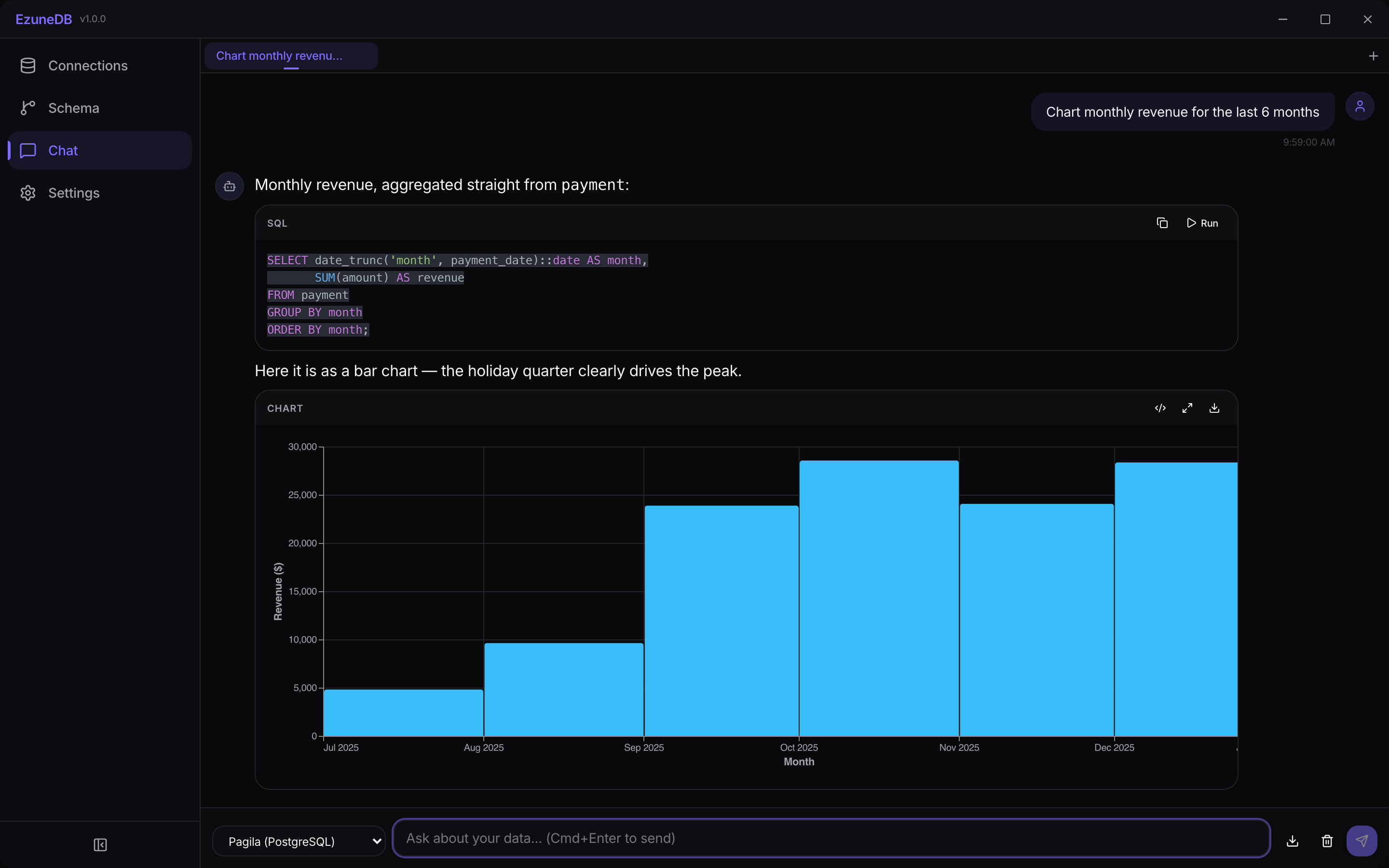
Ask "Chart monthly revenue" — get SQL, chart, and explanation in one answer
1Ask for a chart
Use chart words in your question — "chart", "plot", "trend", "compare" — and the AI responds with the SQL it wrote and an interactive chart of the results, rendered right in the conversation.
From question to rendered chart in one exchange
2Work with the chart
Every chart is interactive and lives in its own block with a small toolbar: view the underlying chart spec, pop the chart out to fullscreen, or download it as an image for a slide or document.
3Charts and raw data together
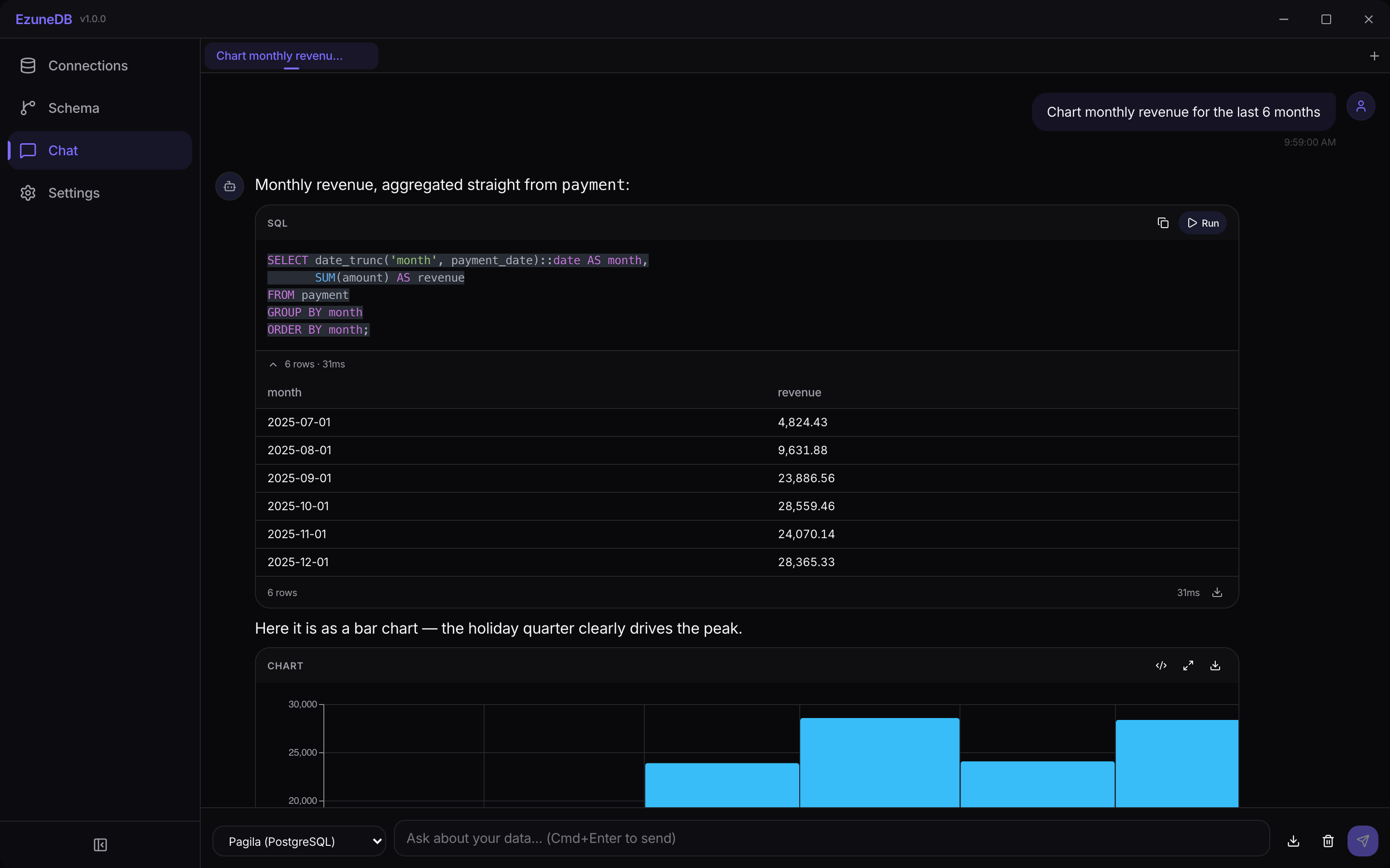
The SQL block above a chart still has its own Run button — execute it to see the raw rows in a table right next to the visualization, so the numbers behind every bar are one click away.
💡 Pro Tip
Ask "Draw a flowchart of how tables are connected" and EzuneDB renders a Mermaid diagram instead — handy for documenting pipelines and joins.